InfoTrax Systems · ValueLabs · 0→1 platform
FlexCloud
The brief said developer portal.
Thirteen interviews later, the unit of design had changed. FlexCloud wasn't a portal, it was a platform shell, and everything depended on getting the hierarchy right before touching a single screen.
- 13Interview sessions, 13 roles
- 5Scope levels, set before any screen
- 3Testing rounds before handoff
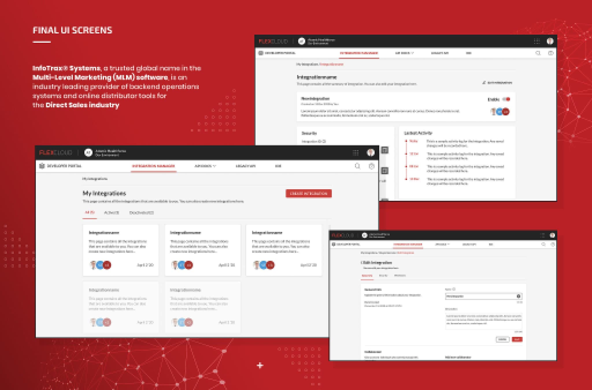
Confidentiality Delivered through ValueLabs. Stakeholders are referred to by role, InfoTrax's own clients are described generically, and the scenario below is illustrative.
01 Context
A monolith trying to become a platform.
InfoTrax provides back-end operations for direct-sales enterprises on a legacy full-stack system, with every deployment customised. FlexCloud was the strategic bet: one SaaS platform, every service as a subscription API. Phase I was the developer portal. Phase II was the commissions engine.
Five constraints from day one
| Constraint | What it meant |
|---|---|
| No industry precedent | The service blueprint had to be built, not benchmarked |
| Every role had to fit | Internal and external users in one ecosystem |
| Users didn't ask for this migration | Legacy-fluent people becoming beginners |
| Agile cycle, internal testing first | Design had to stay ahead of build |
| Under-developed style guide | A design system was a prerequisite, not a deliverable |
02 Stakeholders
Three stakeholders. Three different products.
| Stakeholder | Position | What it meant |
|---|---|---|
| VP of Product | Self-service is the business case | Clients need their own API access on their own login |
| Product Manager | Functional, but not right | It works, but there's a better approach |
| VP of R&D | Internal teams first | Hear complaints from our own people before clients do |
The third position reorganised everything. If internal teams were the first users, this wasn't a client-facing portal. It was a system internal and external users would both live in, with very different permissions.
In practice: a developer managing five integrations needed the one scoped to their test environment and had no way to filter by environment, owner or status. They kept a bookmark for each environment. That was the interface.
No direct-sales company had done this, so we looked sideways at Shopify, Box and Slack, and built a side-by-side IA comparison between Box's console and FlexCloud's structure. It made the gaps arguable, not just assertable: permission scoping, environment isolation and developer-specific views were all missing.
03 Research
What thirteen sessions changed.
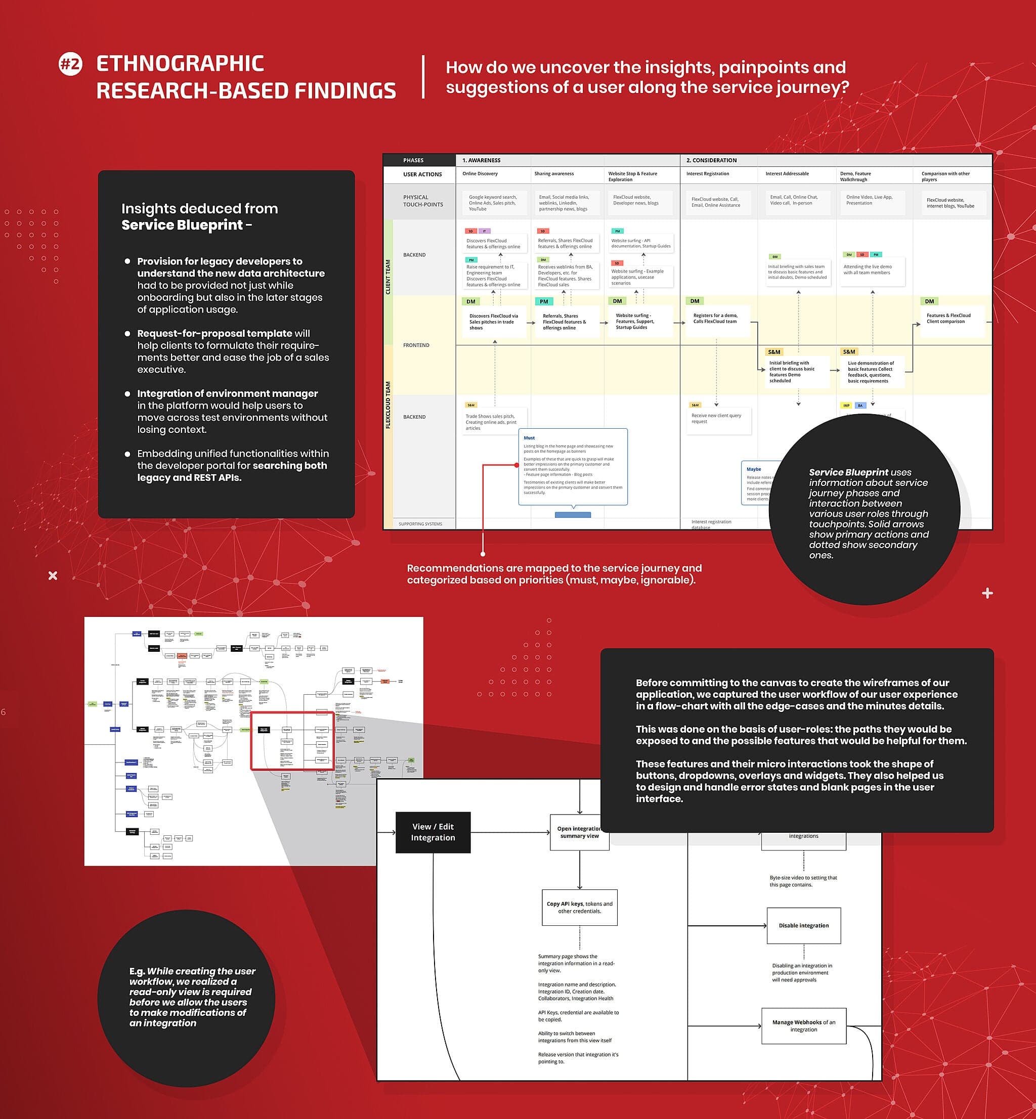
Thirteen sessions across thirteen roles, then six weeks of synthesis. Each session walked participants through a deliberately hypothetical blueprint, then through the legacy services they actually used. Putting a wrong version in front of people surfaces what nobody thinks to mention.
Three tiers, not three personas
| Tier | Who | Relationship to FlexCloud |
|---|---|---|
| Customer | CTO, CXO | Buy it, never use it |
| Users | Developers, IT admins, implementation managers, system admins | Live in it daily |
| Served | Account managers, BAs, support analysts, PMs, sales | Affected without touching it |
The tier structure is what made the permission model fall out naturally later. Participants also kept trying to do things the blueprint had no place for: switching organisations, isolating work to an environment, seeing only what their scope allowed. The blueprint assumed a portal. Their corrections assumed a platform. That gap was the finding.
Recommendations were prioritised as must, maybe and ignorable, which turned a list of good ideas into a roadmap the client could act on.
04 The reframe
FlexCloud isn't a portal. It's five levels of hierarchy.
- L1UserWho you are, and what scope you see
- L2OrganisationsInternal users span several; external users sit in one. Switching is first-class.
- L3EnvironmentsDev, QA, Staging, Preview, Live, Commissions, gated by scope
- L4ApplicationsIntegrations Manager, API Docs, SDKs, legacy access, IDE
- L5Sub-apps and tasksWhere the actual work happens
The existing build treated FlexCloud as a flat set of pages. It couldn't handle internal users spanning several organisations, or environments gated by scope. I defined the hierarchy before drawing anything. Once it was settled, the IA, navigation, permission model and environment switcher resolved almost mechanically.
I explored six foundation layouts, each with annotated trade-offs: where organisation and environment switching lived, how navigation collapsed, how far sub-menus reached, and how visual weight signalled depth of scope.
Decision · Portal or platform shell
- Rejected
- A developer portal: a flat set of pages for external developers. Faster to a first release, but it breaks the moment internal teams need it, and environment switching stays a bookmark.
- Chosen
- A platform shell with five scope levels: User → Organisations → Environments → Applications → Sub-apps and tasks. Internal and external users share one model with different views.
- Trade-off
- The hierarchy had to be fully resolved and agreed before any wireframe, so the first sprint felt slower.
05 Design
Four problems worth showing.
Every workflow was flow-charted before wireframing, including edge cases, error states and micro-interactions. That discipline caught the read-only gate: letting users edit directly without first seeing a summary created accidental-modification risk in live environments. It came from a flow diagram, not a wireframe, and usability testing later surfaced the same gap independently.
| Feature | The problem it solved |
|---|---|
| Environment Manager | Developers switched environments through bookmarks and credentials. It became a persistent control with per-environment URLs, visible access windows and no-access states with inline request paths. |
| Scoped search | Legacy and REST docs were split across two systems. One bar, switchable between everywhere and a specific organisation. |
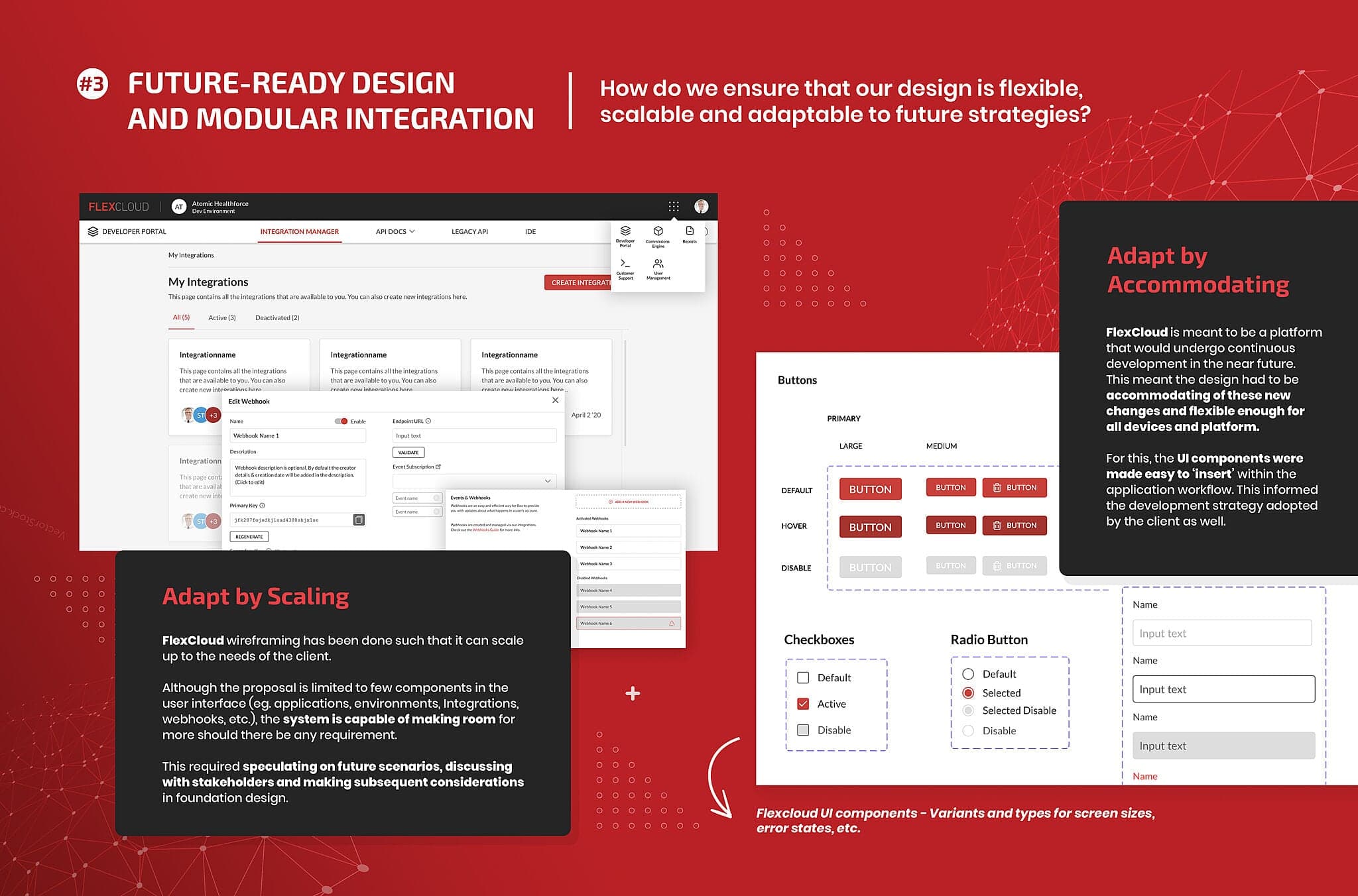
| Integration cards | The grid collapsed under real volume. Seven card variants covered collaborators, enable/disable, errors, long names and relative timestamps. |
| Help and Support | Bug reports arrived as descriptions. Feedback now carries an annotatable screenshot plus diagnostic data, so issues arrive reproducible. |
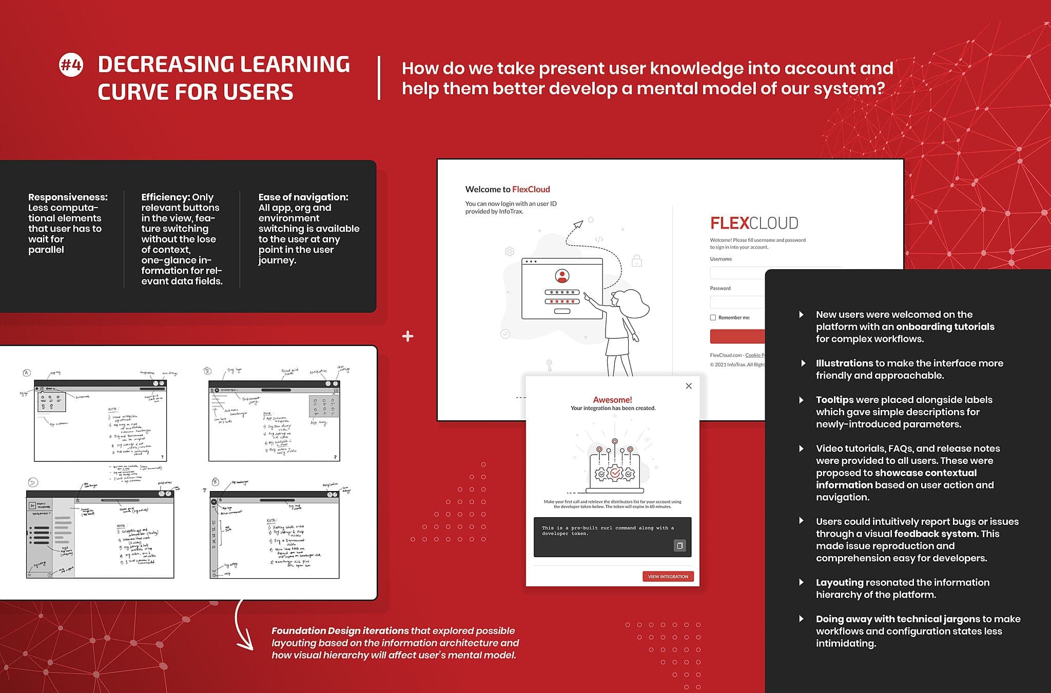
Illustrative scenario: fixing a broken integration in production
- 01Lands in the organisationThe environment selector shows Production active.
- 02Finds the integrationScoped search filters to Production only. No bookmark needed.
- 03Checks the docsAPI documentation scoped to this environment, without irrelevant endpoints.
- 04Files a reportA bug report with screenshot and diagnostic data attached, reproducible from day one.
06 Design system
Built from a loose colour list.
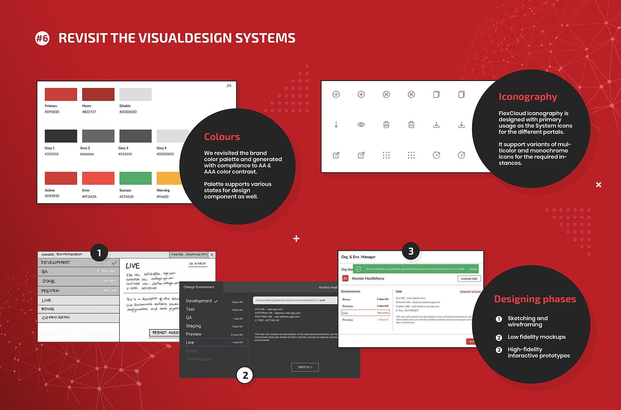
InfoTrax had colour values and little else, so I built the system alongside the product. The palette was rebuilt as a semantic set from the brand primary and tested against WCAG AA (4.5:1) and AAA (7:1), because enterprise clients required it contractually. A custom icon library on a 24px grid with a 2px stroke, and full component variant sets, each with error and empty states. Sketch, low-fi and high-fi interactive prototypes; nothing skipped a rung.
- Primary
#D93030 - Hover
#B22727 - Error
#FF3A3A - Success
#27AE60 - Warning
#FFAB00 - Grey 1
#333333 - Grey 3
#555555 - Grey 2
#666666 - Disabled
#DDDDDD
The only test a design system has to pass: could the client's developers extend the platform after we left without re-deriving the rules?
07 Testing
Prototypes as the argument.
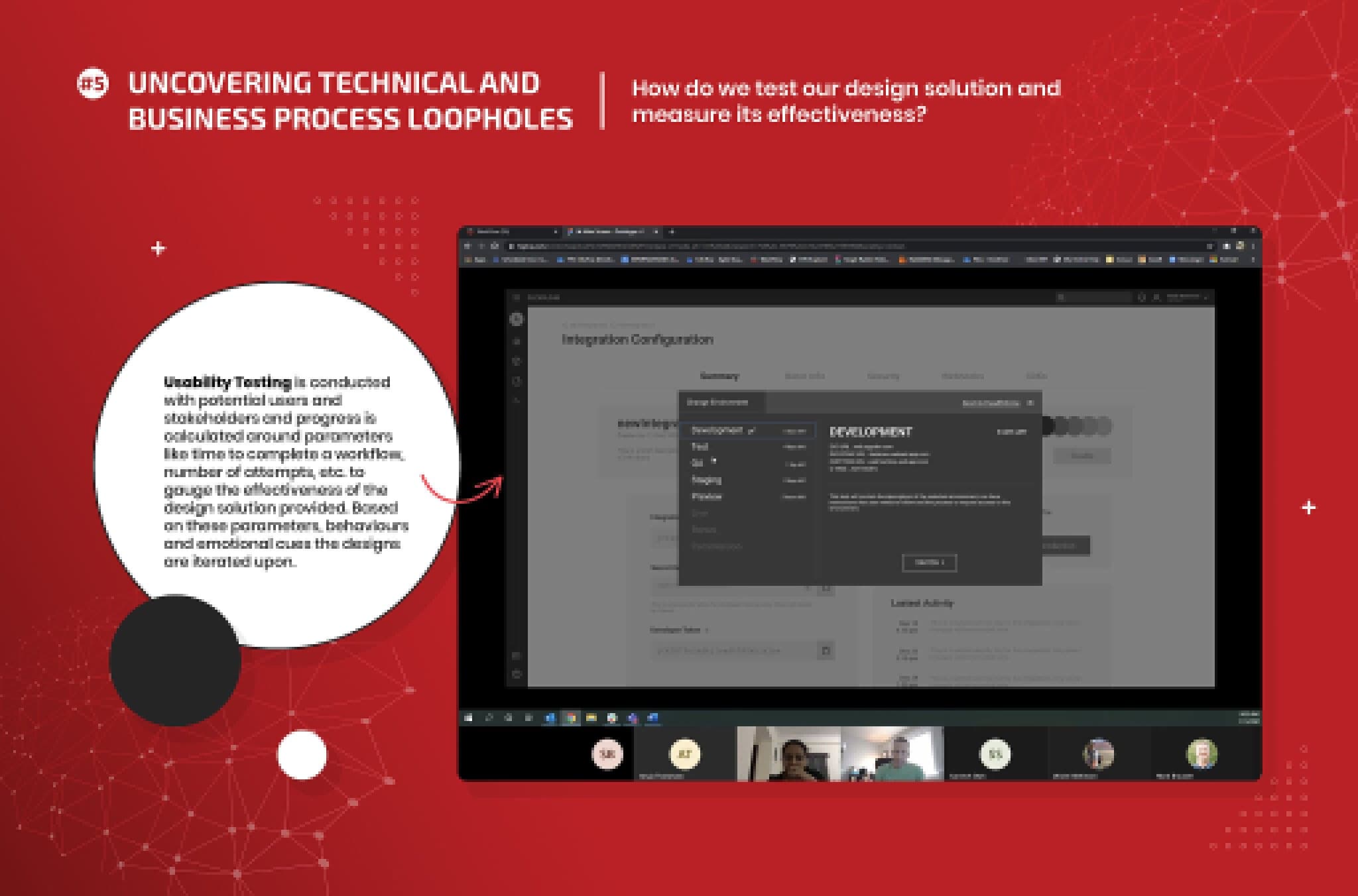
Moderated testing with real InfoTrax roles: software developers, the implementations team, and product and R&D leadership. One of us facilitated; I observed and took findings back into the designs. We measured time to complete, number of attempts, and behavioural cues like hesitation and backtracking, over three iteration rounds before handoff.
08 Outcome
What shipped, and what I can't claim.
- 13Interview sessionsAcross 13 roles
- 6Foundation layoutsExplored and annotated
- 3Iteration roundsFrom testing, before handoff
- Delivered
Scope hierarchy
Five-level platform architecture, validated with stakeholder and research output.
- Delivered
UI and flows
Foundation layouts, four feature flows, wireframes and high-fidelity prototypes.
- Delivered
Design system
Token set, AA/AAA-tested palette and a component library with all states.
- Not collected
Post-launch metrics
I'd defined what to measure (API adoption, ticket volume by workflow, error rate in integration creation) but moved on before data existed.
Reflection
Defend hardest: the sequencing
Six weeks of synthesis before a wireframe felt indulgent. Once the five levels were settled, everything else resolved.
Change: measurement
Rigour on the way in, nothing on the way out. Next time a baseline goes in before launch.
Foundations look like a detour
The design system felt like overhead for a month and was the most important work on the project by the end.